View Instructions for Manipulating the Map and the Scatterplot
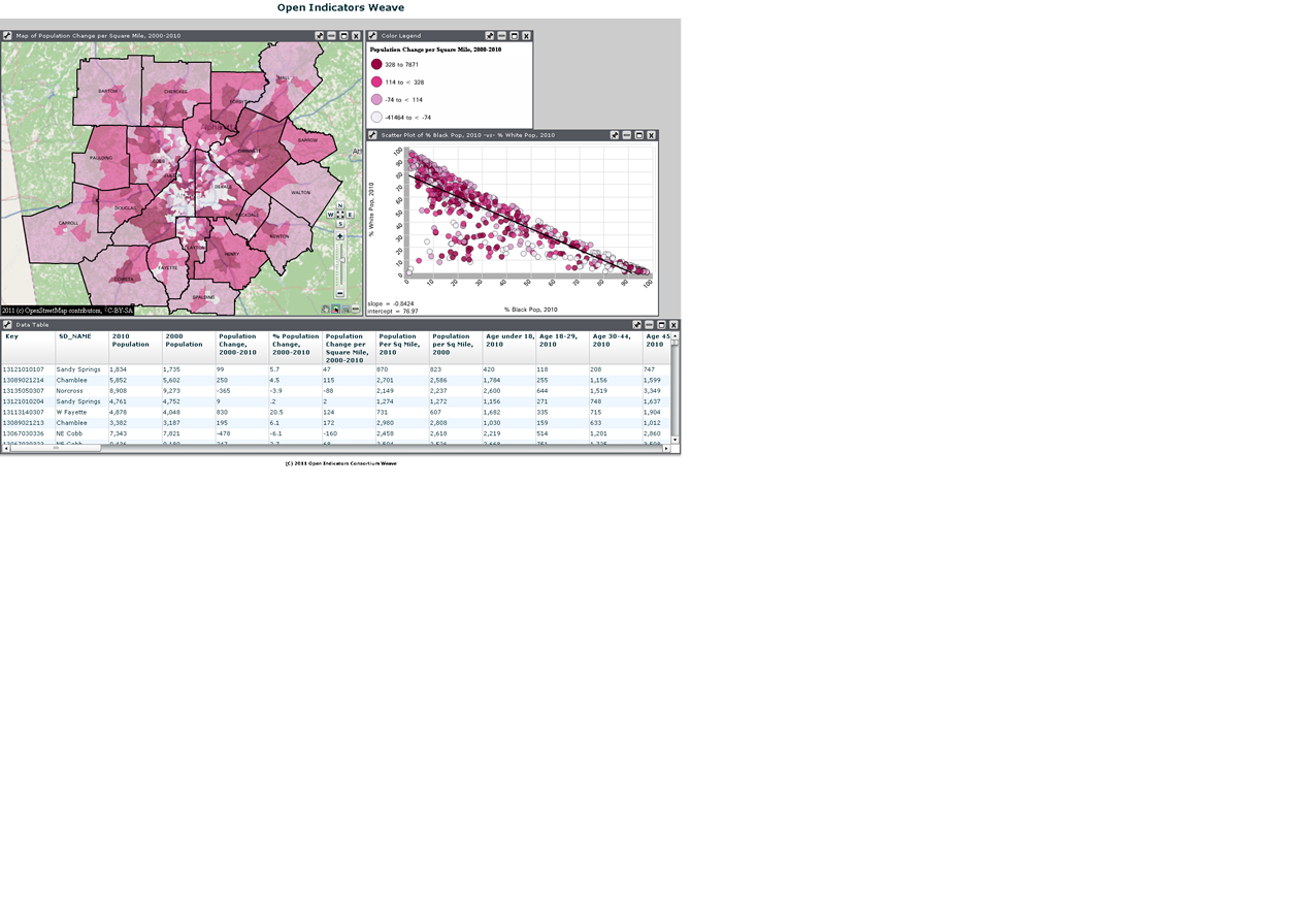
The data on both the map and the scatterplot are linked, meaning that if you select data on the scatterplot, the corresponding areas on the map will be highlighted.
Map: To change the variable being mapped, click on the legend title ("Population Change Per Square Mile, 2000-2010") and select a category from the left side of the table and a variable from the right side of the table.
Scatterplot: To change the variables on the X (horizontal) and Y (vertical) axes, simply click on the title and select different variables for each axis. Also notice the thin line - this is a regression line that shows "neatness" of fit. It shows the relationship between the two variables. Any point that is a significant distance from the line is an "outlier," meaning that the expected relationship (the line) does not hold.
Also note there is a data table where you can download all of the census variables at once. If you are only interested in downloading a subset of the data (like only a few census tracts in your neighborhood, for example), then select the areas you want data for on the map. Since the table and map are linked as well, the areas you selected will be highlighted in the map. On the menu bar, click "Subsets", then "Create subsets from selected records."